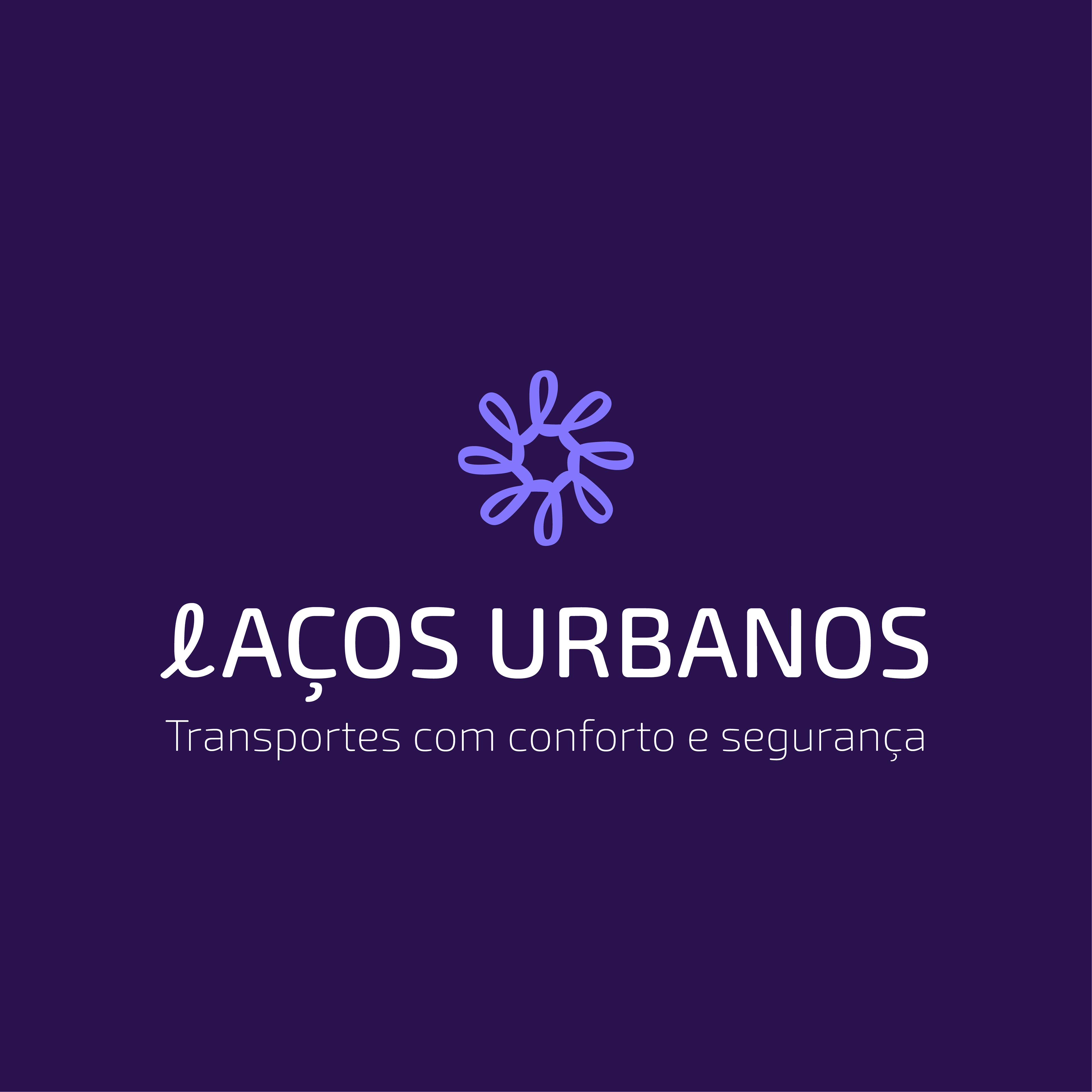
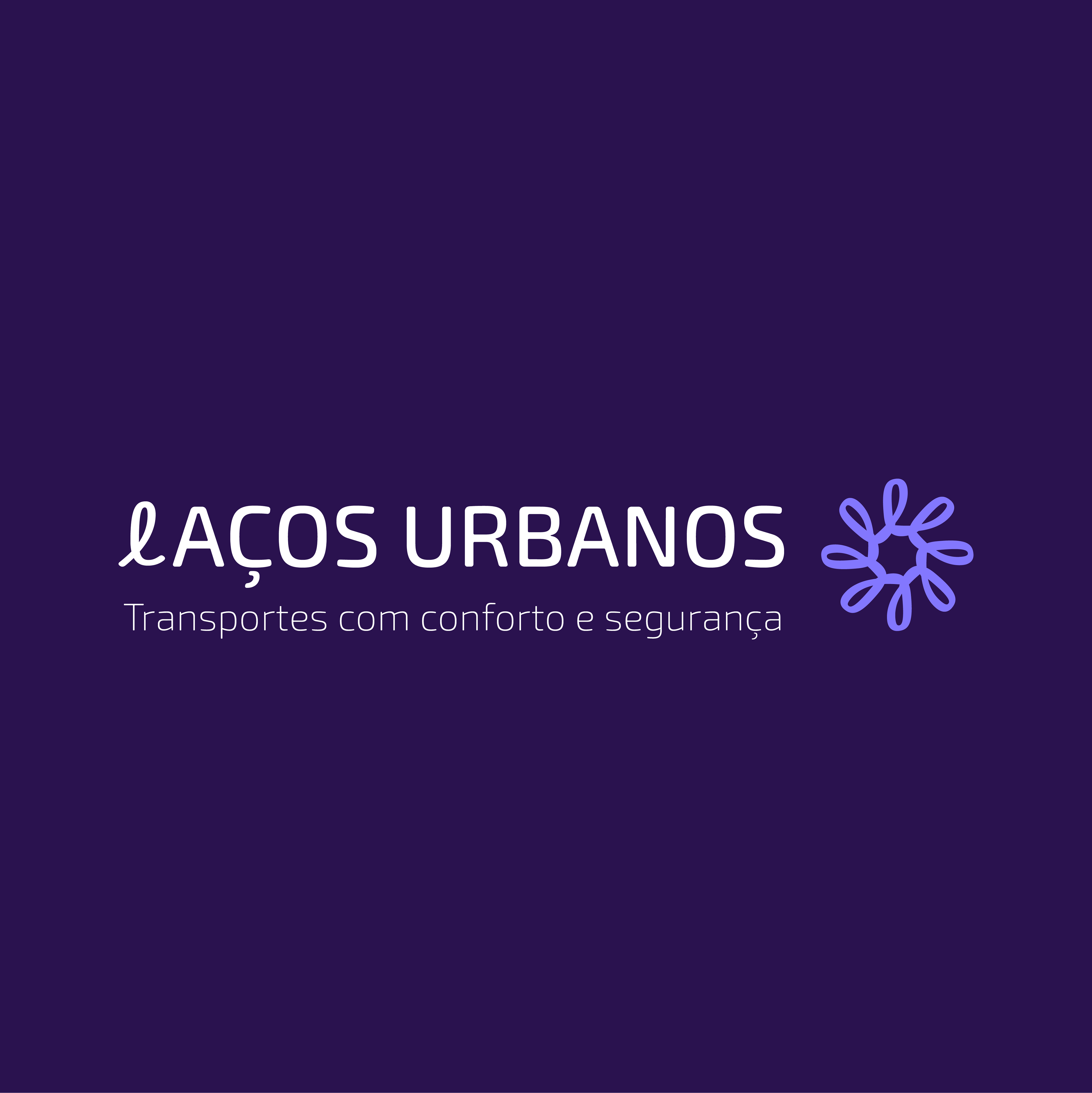
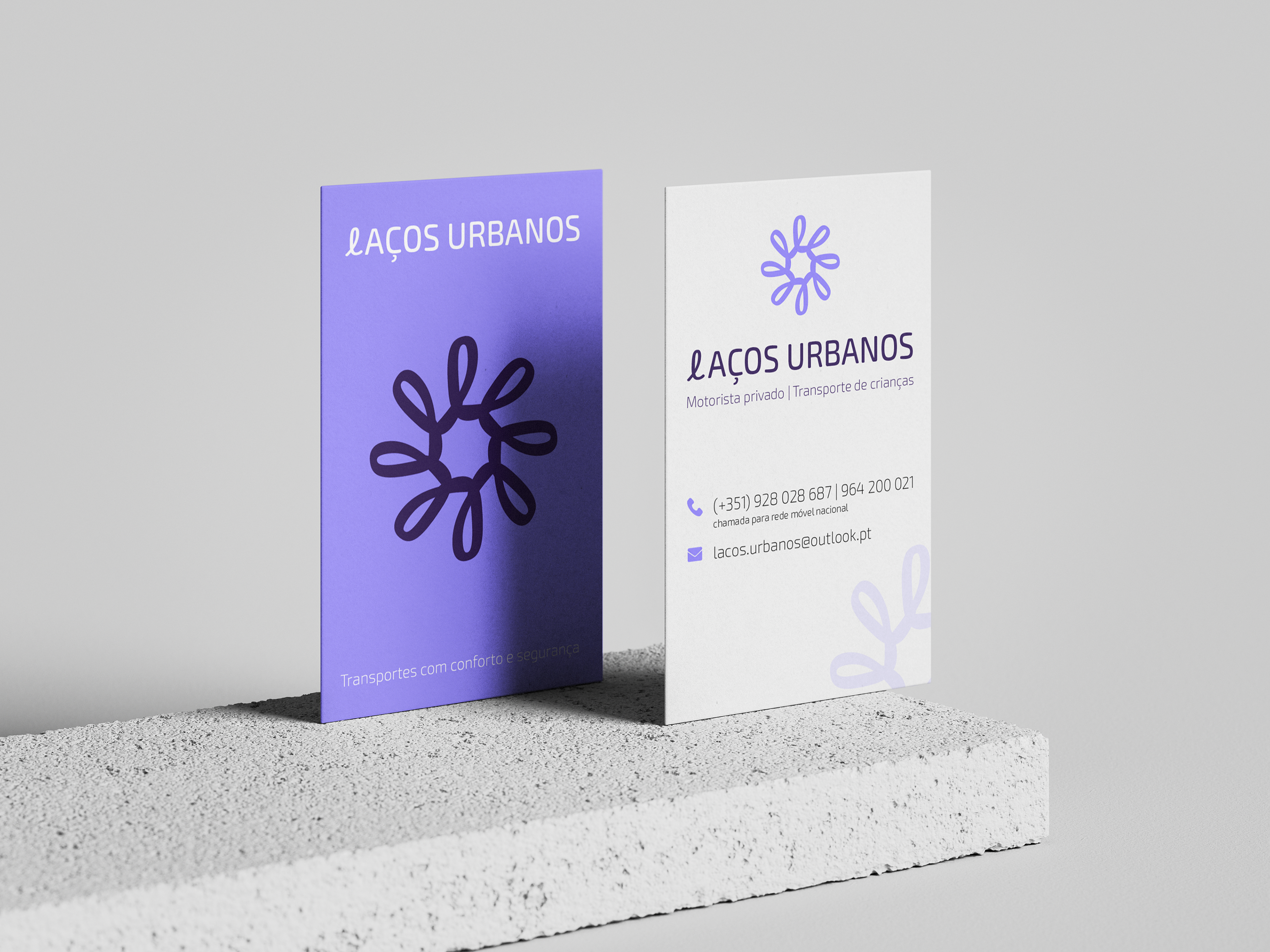
Laços Urbanos | Logo Design
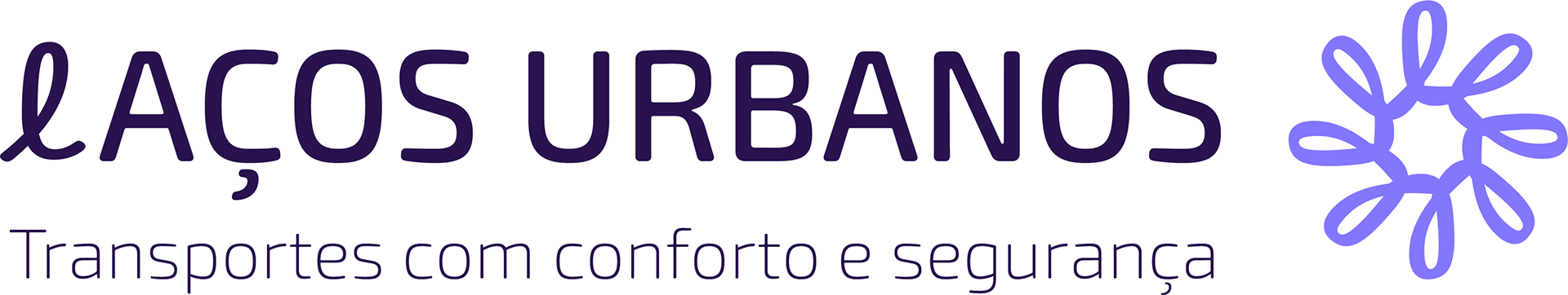
Laços Urbanos is a a transport company that prioritizes above all the trust, safety, and comfort provided to each client.
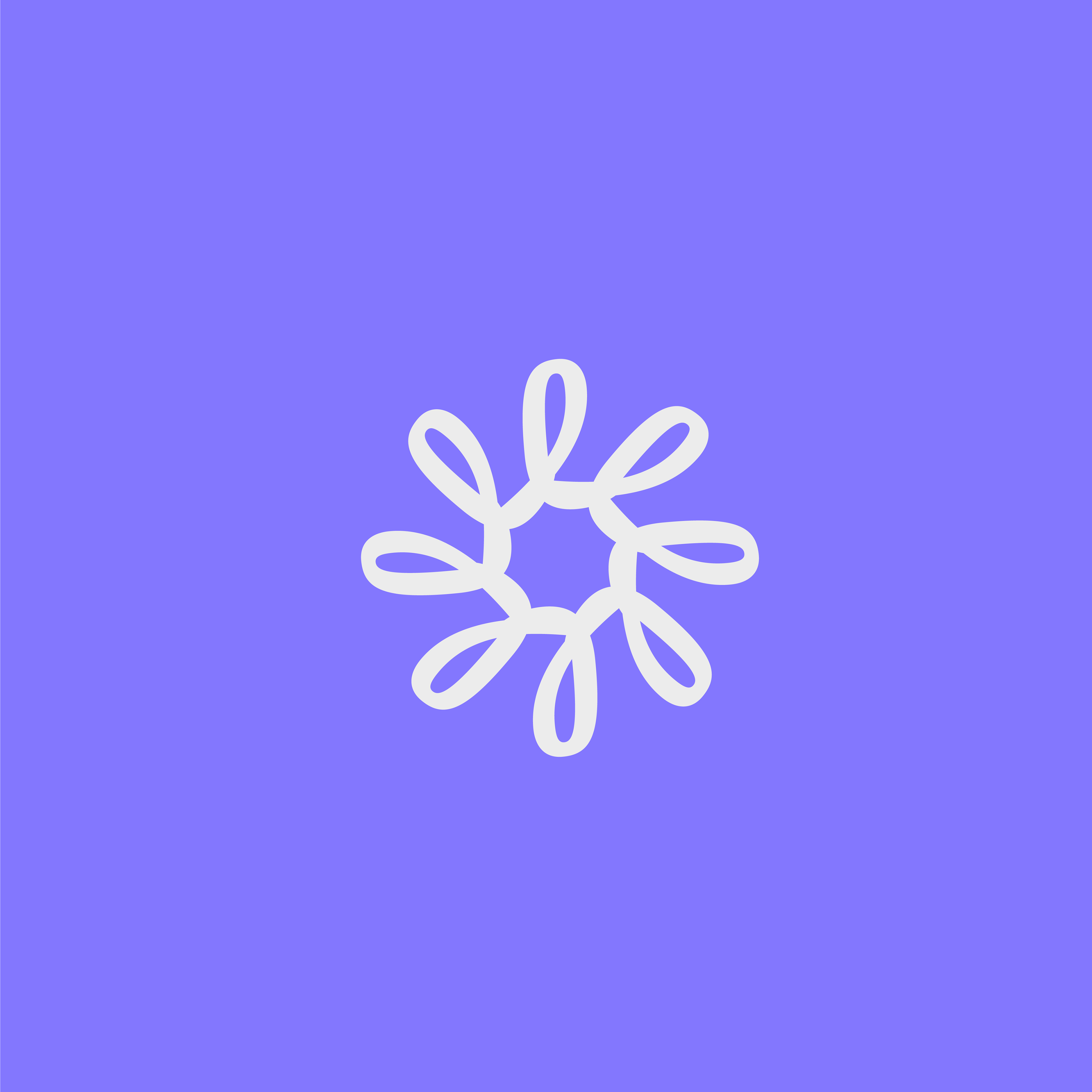
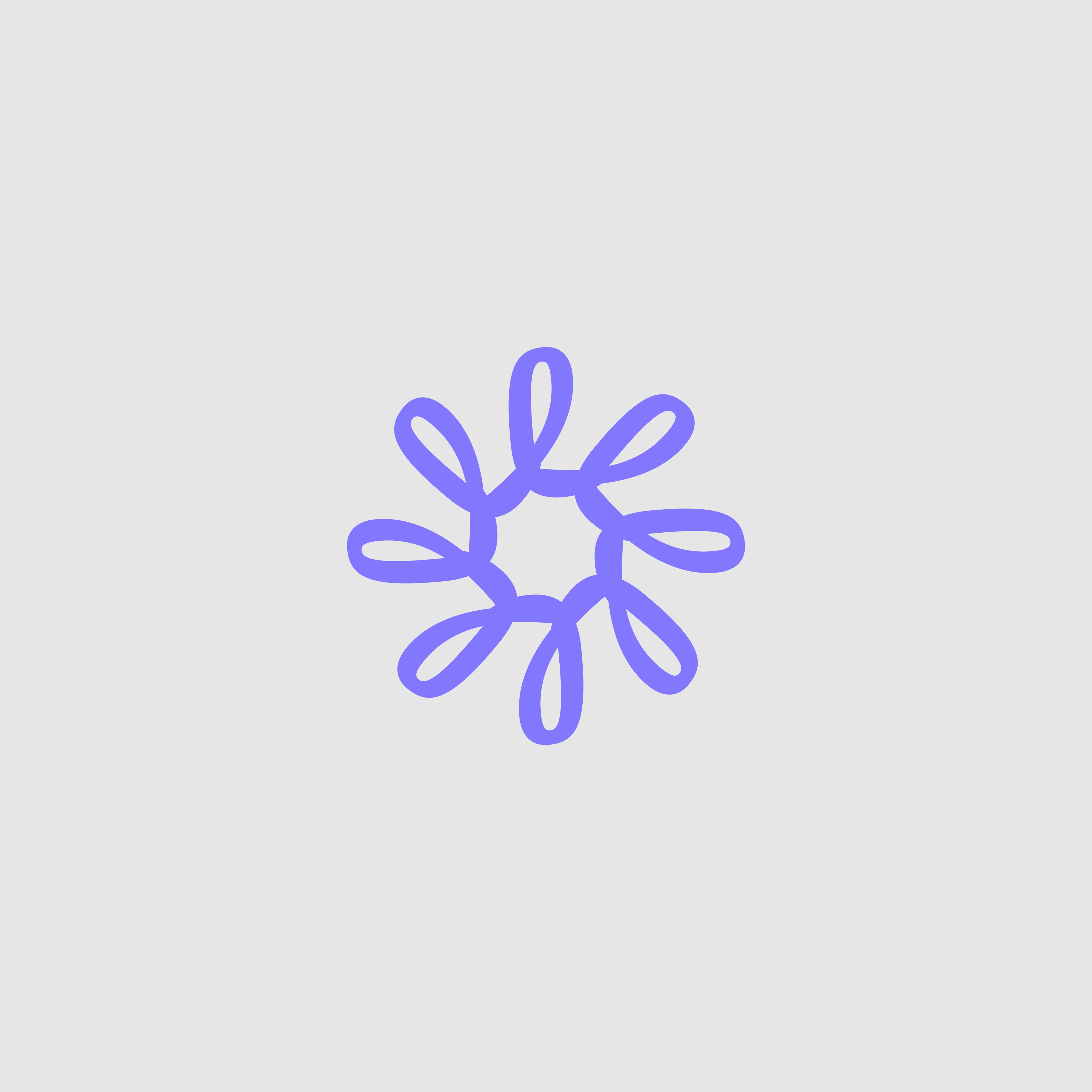
A unique symbol was created from the letter L, the company’s initial, resembling a loop that symbolizes unity, connection, and care.
The composition of several interlinked loops creates a dynamic, flowing structure, representing the connection between people and places - a reflection of the company’s essence.
Shades of lilac and deep purple convey trust, seriousness, and professionalism, while adding a touch of modernity.
A simple and strategic result that reflects a company that is approachable and safe!