Irmãos Araújo | Brand Identity
The Irmãos Araújo is a metalworking company that stands out for its tradition combined with innovation.
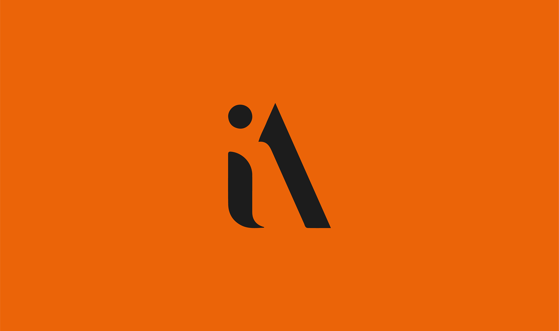
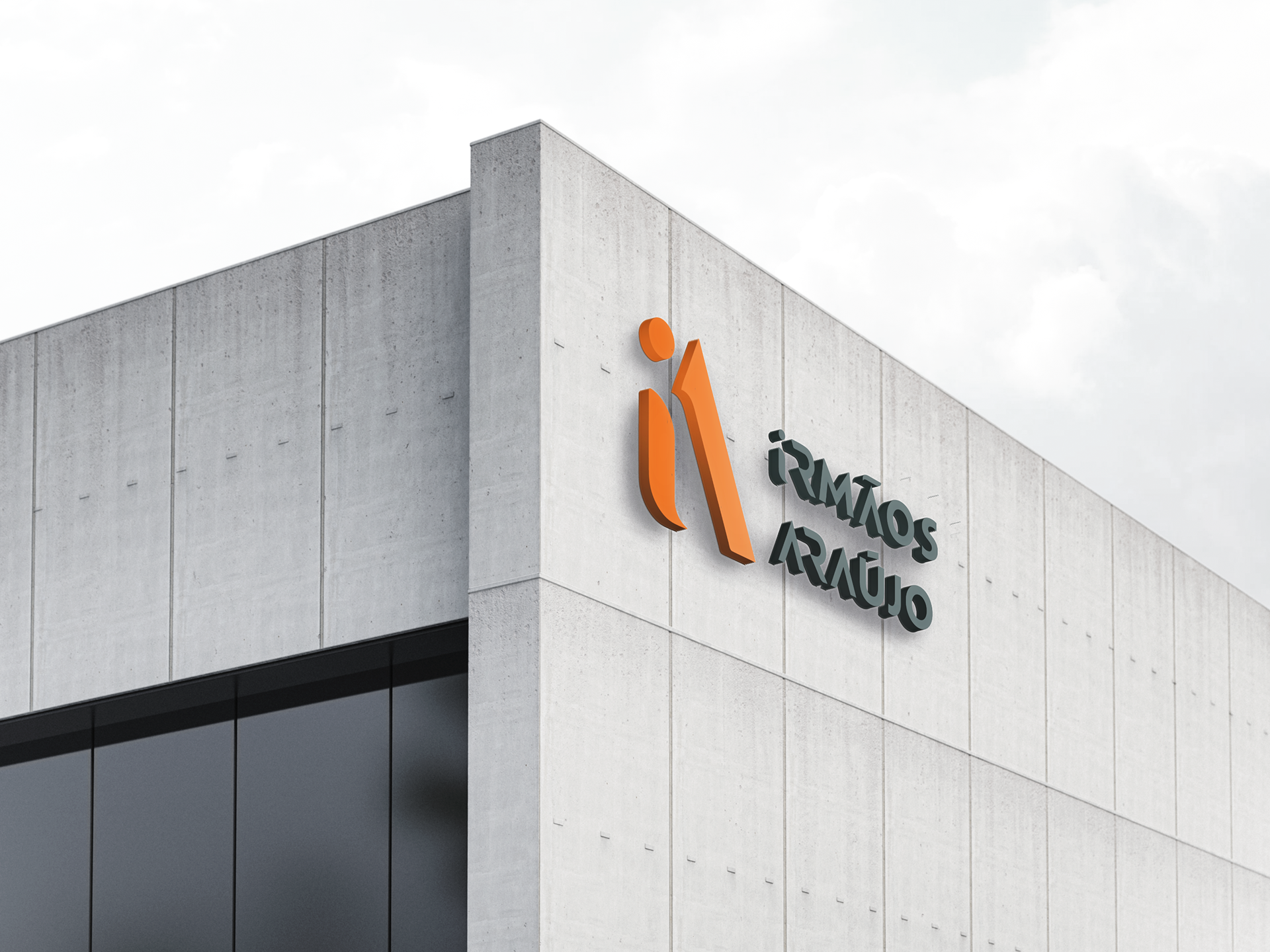
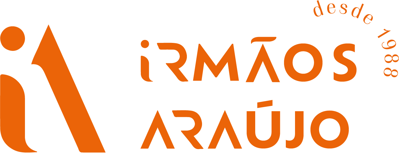
A unique shape was created, incorporating the “i” as an integral part of the letter A (the initial of the owners’ surname), while at the same time resembling the profile of window frames, the brand’s main product.
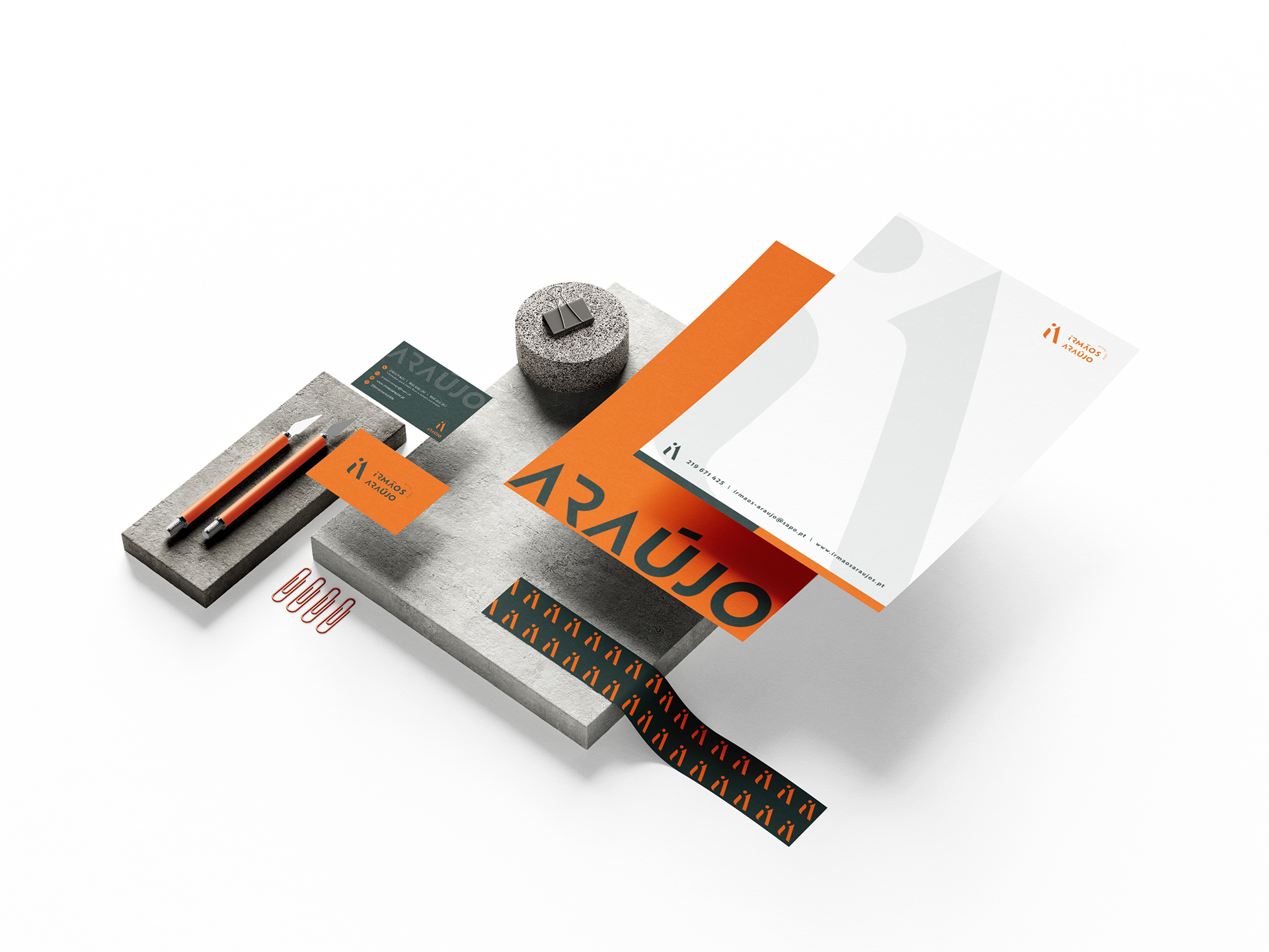
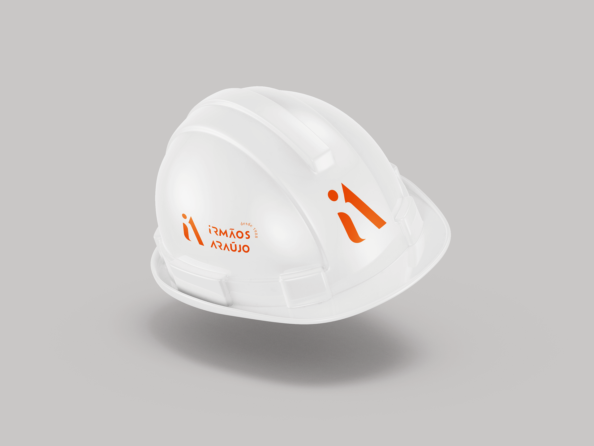
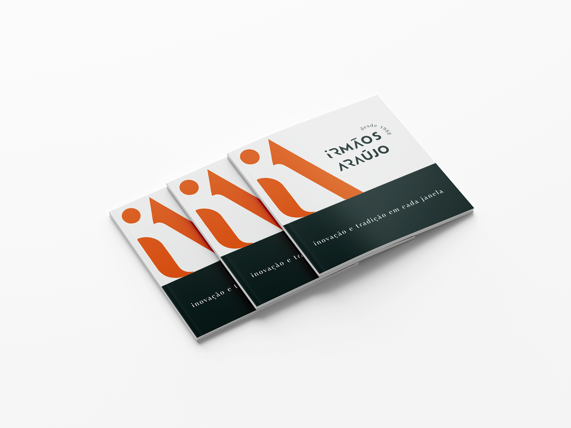
The year of foundation reflects confidence and credibility, conveying the experience that defines the company’s generational legacy.
Orange stands out as the brand’s signature color since the beginning, contrasted with a darker shade of green that conveys service excellence and results in a vibrant visual palette.
An identity that stands out, stays in memory, and reflects the brand’s values!
After more than 30 years in existence, this is the first visual identity of Irmãos Araújo and now they’re set to become the most stylish in the area.